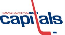
Now that the new Capitals sweaters have been unveiled, the Deuce an I weigh in.
I'm not a huge fan. I was certainly a proponent of moving back to the traditional look, but I just don't think the logo on its own on a HUGE field of red gets the job done. I've said it a million times, but taking inspiration from the Russian jerseys would have been a move in the right direction. That said, as a fan of the original Caps jerseys, I'm not horrified by the new design. I have a feeling it will grow on me, but there was an opportunity here to redefine the franchise while still referencing the past that I think the organization missed out on.
The Deuce's take:
I like them. For years everyone was screaming that the old jerseys were "old school" and we needed to return to the "traditional Caps look." I even posited that they should use the old reds as the alternate/third jersey, like Buffalo did this year. Well, this is pretty darned close. I like it more than the busy, stars and stripes road jerseys. I like the font -- and remember, you can always tweak the design from year to year. Just look at Ottawa (going from those beautiful Roman centurion blacks to the stupid cartoonish Roman Meal reds).
I also like the eagle -- similar to DC United's Eagle (which is still the baddest-ass), and incorporates the washington "W", the eagle, and the Capitol Dome all at once. I have a funny feeling we'll be seeing a 3rd Jersey with that Eagle on the front next year, and that's fine by me. Most importantly, THEY COULD HAVE DONE MUCH WORSE (Tommy Hilfiger's bandana eagle)!!! They've come up with a nice, modern design that is not too radical, and brings back memories of the old jerseys. If they had put a different eagle, or the silly-looking Capitol dome on the front, half of the fans would be screaming that it's worse than the BUFFASLUG.
All in all, I like the colors, I like the eagle, and the letters don't look bad. I've always said I wanted a logo, not lettering, but after seeing those awful black jerseys for the past 6 years, I prefer "Capitals." Even if it makes no sense, as the word capitals is spelled in lower-case, but whatever. It's the team's name that's a problem, but I don't want them to change that at this point. I've always said, just because it's DC, doesn't mean you have to name the team Capitals, Senators, Diplomats, Nationals, lobbyists, politicians, congressmen, etc. etc. etc. That's why I love "D.C. United," and their fierce black and read color scheme with the bad-ass eagle (in fact, the first eagle was so fierce it scared people into changing it because it looked too mean! Now that's bad-ass!)
In summary, could've been better, could've been MUCH worse, will look GREAT on the Russian Machine, and Original Six WILL be purchasing me a custom #8 jersey for my birthday -- even if I have to wait a month to get it.
Friday, June 22, 2007
Jersey talk
Subscribe to:
Post Comments (Atom)


No comments:
Post a Comment